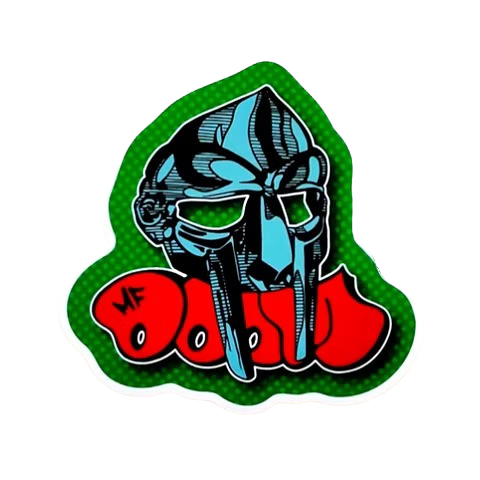

The MF Doom logo works as recognizable shorthand for the entire catalog, built from a bold, blocky lettering style paired with the sculpted villain mask icon rather than a typical wordmark alone. This guide breaks down what makes the design distinctive and where it shows up across the range at MF Doom Store.
What Makes the MF Doom Logo Font Distinctive?
The lettering leans heavy and blocky, favoring bold, angular letterforms over a rounded or delicate typeface, which reads clearly on a t-shirt chest print or a small pendant alike. That boldness is intentional: a thin, decorative font would get lost on fabric printing at a distance, while the heavier weight used in the MF Doom logo stays legible even on a smaller graphic.
Letter spacing also plays a role, with the blocky characters sitting close together rather than spread out, giving the wordmark a dense, stamped-on look that reads as graffiti-adjacent rather than corporate branding.
Visual consistency across different pieces matters too. The same core lettering style shows up whether the MF Doom logo appears on a small sleeve tag or a large chest print, which keeps the visual identity recognizable across the entire catalog rather than shifting from one piece to the next.
How Does the Mask Icon Relate to the MF Doom Logo?
The sculpted villain mask often appears alongside or integrated directly into the lettering, functioning as a visual anchor that reinforces the wordmark even when the text itself is small or partially obscured by fabric folds. Pairing the icon with the MF Doom logo text creates redundancy, so the design still reads clearly even if only one element is fully visible.
Some prints separate the two elements entirely, using the mask as a standalone graphic and the wordmark as a smaller secondary detail, which works better on pieces where a large central mask print is the main visual focus.
This flexibility is part of why the design translates so well across different product categories, from a large hoodie graphic down to a small pendant, without ever needing to compromise on legibility or recognition at either end of that size range.
Where Does the MF Doom Logo Show Up Across the Catalog?
Chest prints on t-shirts, hoodies, and sweatshirts are the most common placement, but the wordmark also appears smaller on sleeve tags and as an engraved detail on some jewelry pieces. The MF DOOM Charcoal Grey Dripping Mask Logo Hoodie uses a dripping-paint treatment on the lettering itself, a stylistic variation on the standard blocky wordmark seen elsewhere. The MF Doom T Shirt collection includes several designs where the lettering itself is the primary graphic rather than a supporting element next to a larger mask print.
For a design that leans more heavily on the wordmark specifically, the MF Doom T-Shirt ALL Caps uses bold typography as the central print rather than the mask icon.
Placement size also varies by garment type. A full chest print gives the MF Doom logo room to breathe, while a sleeve tag or small pocket print scales the same lettering down without losing legibility, since the underlying letterforms were built with that kind of flexibility in mind from the start.
Does the MF Doom Logo Style Connect to Graffiti Art?
Yes, the blocky, dense lettering style shares real visual DNA with graffiti tagging conventions, particularly the bubble-letter and block-letter traditions common in that scene during the era the artist was most active. For a closer look at that connection, MF Doom Graffiti Art Style Guide covers the broader graffiti influence across the visual identity in more depth.
That shared lineage is part of why the design feels at home on streetwear specifically, rather than reading as a typical band-merch wordmark borrowed from a different visual tradition entirely. Understanding the MF Doom logo through that graffiti lens also explains why it holds up so well on textured or distressed print treatments, since the bold letterforms were built to read clearly even with some visual noise layered on top.
Can You Find the MF Doom Logo on Jewelry Too?
Yes, though jewelry tends to favor the sculpted mask icon over the lettering itself, since a 3D wordmark is harder to render clearly in a small ring or pendant than the mask shape is. The MF Doom Ring and necklace collection leans on the mask icon as the primary design element for exactly this reason, with the wordmark showing up mostly on apparel instead.
If you have questions about a specific print or engraving detail before ordering, the Contact Us page connects you directly with support. If sizing on a printed piece turns out wrong once it arrives, the Refund and Returns Policy covers exchanges.
Comparing a piece against verified product photos before ordering is still the most reliable check, since lighting and camera angle can make a genuine print look slightly different from one listing photo to the next.
The MF Doom logo works because the bold lettering and the mask icon reinforce each other rather than competing for attention, giving the design real staying power across two decades of merchandise. Whether a piece leans on the wordmark, the mask, or both together, the same design principles carry through the entire catalog consistently, from a small pendant all the way up to a full double-sided hoodie print.
Understanding what makes the logo work also makes it easier to spot a lazy or generic knockoff, since a design missing that bold, dense lettering weight rarely captures the same effect convincingly.
A knockoff print often gets the mask shape roughly right while getting the lettering completely wrong, either too thin, too rounded, or spaced too loosely, which is usually the fastest tell that a piece wasn’t produced with the actual reference design in hand. Comparing letter weight and spacing side by side against a verified piece is a more reliable check than judging the mask graphic alone, since the mask shape is easier to approximate roughly than the exact lettering proportions are.
Frequently Asked Questions
What font style does the MF Doom logo use?
A bold, blocky, angular lettering style rather than a rounded or delicate typeface, chosen specifically for legibility on fabric printing at a distance. The dense letter spacing gives it a stamped-on, graffiti-adjacent look rather than a typical corporate wordmark you’d see elsewhere.
Is the mask icon part of the logo or separate from it?
Both, depending on the specific piece. Some designs integrate the mask directly into the lettering for redundancy, while others use the mask as a standalone graphic with the wordmark appearing much smaller elsewhere on the same print or garment entirely.
Does the logo style relate to graffiti art?
Yes, the blocky lettering shares real visual DNA with bubble-letter and block-letter graffiti tagging conventions common during the era the artist was most active, which is part of why the design feels at home on streetwear specifically rather than typical band merch.
Where does the logo show up most often in the catalog?
Chest prints on t-shirts and sweatshirts are the most common placement. Jewelry tends to favor the sculpted mask icon over the full wordmark, since a 3D lettering piece is harder to render clearly in a small ring or pendant than the mask shape is.