
An MF Doom graphic tee works differently depending on what the print actually references, and knowing the difference helps you pick a design that means something specific rather than just grabbing whatever looks bold in a thumbnail. This piece breaks down the design language used across the tee range at MF Doom Store, from typography-driven pieces to full character illustration.
None of this requires deep catalog knowledge to follow. Once you know the three broad categories, typography, character illustration, and memorial, picking a design becomes a matter of matching the print to what you actually want it to communicate.
What Counts as an MF Doom Graphic Tee?
Any tee where the print is the main visual event, rather than a small chest logo, counts as a graphic tee in this catalog. That includes full front artwork, bold all-caps typography, and character illustrations referencing the villain mask, all of which use significantly more surface area than a standard small-logo tee would.
This distinction matters quite a bit because it fundamentally changes how the whole shirt reads from a distance. A small-logo tee is subtle enough to blend into a plain outfit, while a full graphic tee becomes the outfit’s focal point by design, which is worth considering before you buy if you’re not used to wearing bold prints regularly.
How Does Typography-Based Design Work on an MF Doom Graphic Tee?
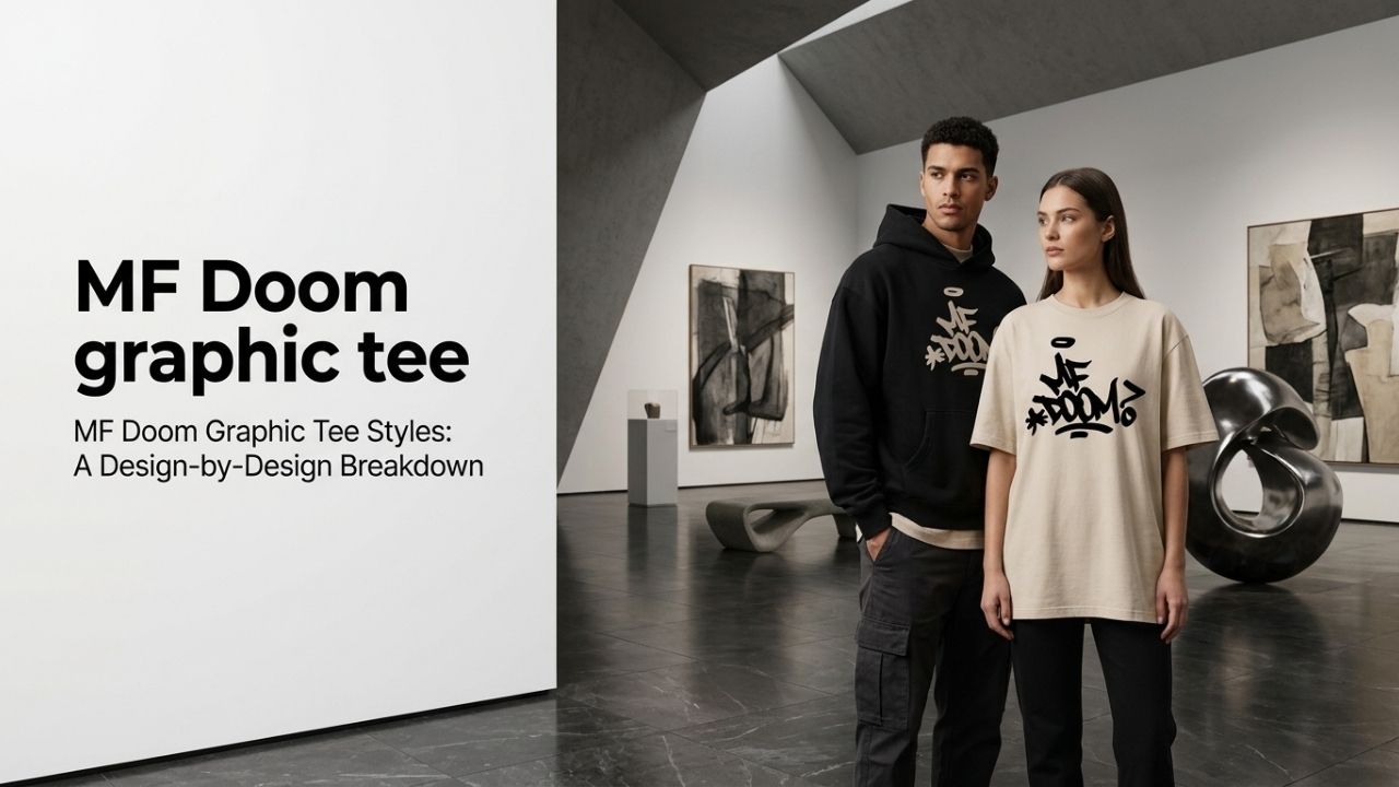
Typography-driven designs use bold lettering, often referencing the “ALL CAPS” track directly, as the entire graphic rather than pairing text with character art. This style reads clean and minimal from a distance, which makes it a good option if you want something recognizable to fans without a busy, detailed print competing for attention.
Because typography relies on shape and spacing rather than illustration, it also tends to age well against fading, since there’s no fine detail to lose as the print wears. A bold word or phrase stays legible even after the edges soften slightly from repeated washing, which makes this style of MF Doom graphic tee a practical choice for anyone planning to wear a single piece often rather than rotating between several.
What Makes Character Illustration Prints Different?
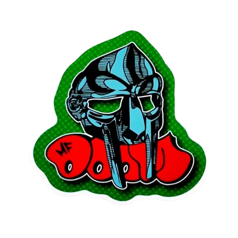
Character illustration prints bring in the villain mask or related artwork directly, often at a larger scale than a typography design would use. These particular prints function much more like a full poster moved directly onto fabric, telling more of a visual story than a text-based design can ever manage on its own, which is part of why they read as more substantial pieces overall.
Because this style covers more surface area with more color transitions, it takes more from a printing standpoint to execute well. A well-made character illustration MF Doom graphic tee should hold its color and edge sharpness through repeated washing, not just look good and impressive on day one alone. That’s a fair test to apply to any piece before buying: does the print quality match the ambition of the design, or does it look like it was rushed onto the fabric without enough consideration for how it would age.
Are Memorial Prints a Separate MF Doom Graphic Tee Category?
Yes, memorial and tribute designs reference Daniel Dumile by name or specific imagery tied to his passing, functioning differently than either typography or character-art prints. These are a more personal category of design, chosen by buyers who want a piece that reads as a tribute specifically rather than general merchandise.
These designs tend to use more restrained color palettes and simpler layouts than the character-illustration category, since the intent is respectful rather than bold or attention-grabbing. It’s a smaller part of the overall catalog, but a meaningful one for the buyers it’s made for.
Does Print Method Affect How the Design Looks?
Yes, simpler one-color typography prints typically use screen printing, which holds crisp edges well, while multi-color character illustrations often need direct-to-garment printing to capture that level of detail accurately. Neither method is better outright, but it does mean a detailed character print needs slightly more careful washing to preserve fine detail over time.
Knowing which method a specific MF Doom graphic tee uses isn’t usually necessary before buying, but it does explain why two designs at a similar price point can feel different in hand, one crisper and flatter, the other with more visible texture where the ink sits on the fabric. If a deliberately worn, distressed texture is actually the look you’re after rather than a crisp new print, Vintage-Style MF Doom Shirts: What to Look For covers that specific aesthetic.
Which MF Doom Graphic Tee Should a New Fan Start With?
A typography-based piece like the lettering styles referencing “ALL CAPS” is the easiest entry point, since the design reads clearly without requiring familiarity with a specific album or era. The MF Doom T-Shirt Black Printed is a solid example of a straightforward, widely recognizable design to start with before moving into more specific character or memorial prints. For a broader look at fit, color, and how to spot a genuine listing beyond just print style, the MF Doom Shirt Buying Guide covers the full tee range.
Where Can You Shop the Full MF Doom Graphic Tee Range?
Every MF Doom graphic tee referenced here comes from the same MF Doom T Shirt collection, and the MF Doom Letter Grey T Shirt is a good example of the typography style available in a lighter base color if black isn’t what you’re after. Browsing the full collection side by side makes the design differences described above much easier to see and compare in practice than reading about them alone ever could.
For a heavier version of some of the same print families, the MF Doom Hoodie collection is worth a look too if the weather calls for something warmer. Once you’ve placed an order, the Shipping Policy covers delivery timing and what to expect after checkout.
Understanding what an MF Doom graphic tee is actually referencing, whether that’s a specific track, the character mask, or a memorial tribute, makes picking a design a lot more intentional than shopping on looks alone. Start with the category of design that matches how deep into the discography you want to go, and the rest of the decision, color and fit, becomes much easier from there.
None of the three categories is inherently better than the others, they simply serve different buyers at different points in their familiarity with the discography. A first-time buyer and a longtime collector can both walk away from this catalog with an MF Doom graphic tee that genuinely fits what they were personally looking for in the first place.
Frequently Asked Questions
What’s the difference between a typography and character print?
Typography designs use bold lettering as the entire graphic, often referencing specific tracks, while character prints bring in illustrated mask artwork at a larger scale. Typography reads cleaner and more minimal, while character prints tell more of a visual story on the fabric itself and take longer to design well.
Are memorial tees a specific design category?
Yes, memorial and tribute prints reference Daniel Dumile by name or imagery tied to his passing, separate from the general typography and character-art categories. These are chosen by buyers wanting something more personal than standard merchandise-style designs offer, and they tend to use quieter, more restrained visuals.
Does print method change how I should wash a graphic tee?
Slightly. Detailed multi-color character prints need more careful washing, inside out in cold water, to preserve fine detail, while simpler one-color typography prints are a bit more forgiving but still benefit from the same basic care routine overall for longevity.
What’s the easiest design to start with as a new fan?
A typography-based piece referencing “ALL CAPS” is the easiest entry point, since it reads clearly without requiring familiarity with a specific album or era, unlike some of the more alias-specific character designs found deeper in the wider catalog available here.