
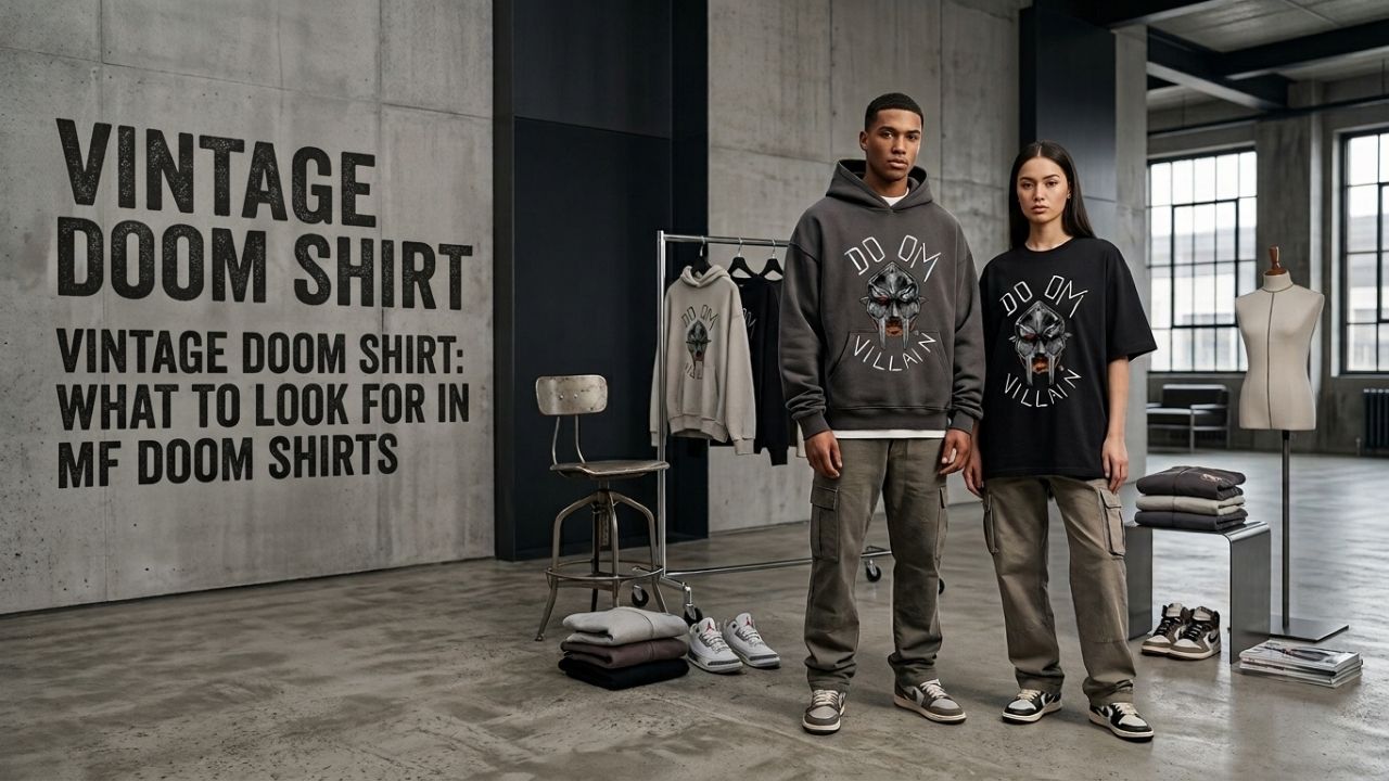
A vintage doom shirt aesthetic isn’t about age, it’s about a specific set of design choices: a distressed or washed print texture, a looser cut, and color choices that echo early-2000s tees rather than a crisp new graphic. This guide covers what actually separates a genuine vintage-style print from a flat, overly clean one, so you know what to look for at MF Doom Store or anywhere else.
This style sits alongside the typography, character, and memorial print families already in the catalog, but it’s really a treatment applied to a design rather than a fourth separate category. Any of those print families can potentially get the distressed, washed treatment depending on the specific listing. For a closer look at those base print families themselves, MF Doom Graphic Tee Styles: A Design-by-Design Breakdown covers each one in more depth.
What Makes a Shirt Read as a Vintage Doom Shirt?
A distressed or slightly cracked print texture is the main signal, mimicking how a real decades-old print would look after years of washing rather than looking factory-fresh. This effect is applied deliberately during printing on new shirts, so a vintage doom shirt doesn’t need to actually be old to achieve the look, just designed with that texture in mind from the start.
Look closely at the actual product photos before ordering anything, since the distressing effect should always look intentional and consistent rather than random or patchy. A well-executed vintage print keeps the underlying design fully legible even through the added texture, which is the clearest sign of a genuine vintage doom shirt versus a lazily filtered image.
Does Fabric Weight Matter for a Vintage Doom Shirt?
Yes, a slightly heavier, looser-woven cotton reads closer to older tee production than the lighter, tighter weave common on newer fast-fashion shirts. That heavier hand-feel is part of what sells the vintage impression, since a thin, stretchy modern fabric undercuts the effect no matter how convincing the print texture looks on its own.
This is one of the easiest details to check before buying, since fabric weight is usually listed in the product description even when you can’t feel the material in person before it arrives at your door. A listing that skips this specific detail entirely is generally worth a second, more careful look before ordering anything. If you’re deciding between this specific aesthetic and a crisp new print more generally, the MF Doom Shirt Buying Guide covers the full range beyond just this treatment.
What Colors Work Best for This Look?
Faded, slightly muted tones rather than bright, saturated colors match the aesthetic best, since true vintage pieces lose color intensity over years of washing and sun exposure. A washed black or a dusty grey reads more convincingly vintage than a stark, high-contrast black, even if the print design itself is identical between the two.
This is where color and texture work together: a faded tone paired with a distressed print reinforces the same story, while a bright, saturated color undercuts even a well-executed distressed texture effect on an otherwise convincing vintage doom shirt.
How Should You Style a Vintage Doom Shirt?
Pair it with straight-leg or slightly baggy jeans rather than slim-fit denim, since the boxier, worn-in aesthetic works better with looser proportions throughout the whole outfit. A plain, low-profile sneaker keeps attention on the shirt itself rather than competing with another statement piece in the same look. This proportion logic carries over from the same 2000s-era streetwear influence that shapes most of the wider catalog.
A denim or twill jacket worn open over the shirt extends the same worn-in aesthetic into a full, cohesive layered look, especially in a similarly faded or washed tone rather than a crisp, dark denim jacket that would clash noticeably with the intentionally distressed print underneath. If sizing ends up off once a piece arrives, the Return and Exchange Policy covers exchanges.
Is a Vintage Doom Shirt More Fragile Than a Regular One?
Not inherently, but the distressed texture effect can make minor wear less noticeable while genuine print damage still needs the same care as any other design. Wash inside out in cold water and skip high heat when drying, the same basic rule that applies to every printed shirt in the catalog regardless of style. A vintage doom shirt isn’t more delicate by design, it just hides early wear a little better than a crisp, flat print would.
Fold rather than hang it long-term to avoid stretching the print area at the shoulders, and treat it with the same care as any other printed tee despite the intentionally worn look.
Where Can You Find a Vintage Doom Shirt in This Catalog?
Several designs across the MF Doom T Shirt collection use this washed, distressed treatment, including pieces like the MF Doom T-Shirt Black Cotton Premium Printed.
The MF Doom T-Shirt Black In Loving Memory uses a similar washed treatment on a memorial-style design if that angle appeals to you more than a purely aesthetic choice would.
If you’d rather build a full look around the aesthetic, the MF Doom Hoodie collection includes similarly styled pieces in a heavier fleece for colder weather.
A convincing vintage doom shirt comes down to texture, fabric weight, and color choice working together rather than any single detail on its own. None of it requires an actual old shirt, just a design built with those specific cues in mind from the start. Check photos closely, compare the fabric description against what you already own, and lean toward faded tones over saturated ones if the aesthetic matters to you specifically enough to be worth the extra attention up front.
Pick a print with that worn-in texture, pair it with looser proportions, and the rest of a vintage doom shirt look falls into place naturally without needing to overthink every individual piece. Start with one print you’re drawn to and build outward from there once you know how the fabric and fit actually feel in hand once it arrives.
Frequently Asked Questions
Does a vintage doom shirt need to actually be old?
No, the vintage look is achieved through deliberate design choices during printing, like a distressed texture and faded color tones, rather than requiring an actually aged garment. New shirts can be printed with this aesthetic built in from the very start of production.
What fabric works best for a vintage doom shirt?
A slightly heavier, looser-woven cotton reads closer to older tee production than the lighter, tighter weave common on newer fast-fashion shirts. That heavier hand-feel is part of what sells the overall vintage impression convincingly to anyone looking closely at the fabric.
Are distressed prints more likely to fade or crack?
Not inherently more than a standard print, though the texture effect can make minor wear less noticeable at first glance compared to a plain design. The same basic care rules apply: wash inside out in cold water and skip high heat when drying to preserve the overall design quality.
What should I pair a vintage doom shirt with?
Straight-leg or slightly baggy jeans rather than slim-fit denim, since the worn-in aesthetic works better with looser proportions throughout the outfit. Keep footwear simple and low-profile so the shirt itself stays the clear visual focus of the whole outfit look.